Showing posts with label pink. Show all posts

Monday, November 19, 2012

I remember you


This is my piece for a group show at Susanita's Little Gallery.  The theme is the Ramones!  It opens early next month.  Each artist got to choose a song to illustrate, and I chose "I Remember You", cuz I like that song.


Acrylic on board.  And fun.

Tuesday, October 23, 2012

the royal tenenbaums


This is my piece for the Spoke Art Gallery's Bad Dads show, opening this weekend in San Francisco!  Wish I could be there.  I wish it would get cold in Los Angeles already, too.  I bet it's fall in San Francisco right now, and I bet it's super nice.

The hardest part was getting likenesses for all the characters.  I do not consider myself very hand with caricature, so there were LOTS of super ugly, generic looking versions of everybody before I got to anything useful.  I think my favorite in the end is Royal.  Or Dudley.  Dudley was the only one I had no trouble drawing at all, strangely!


It's 20"x26",  acrylic on board.


I should accompany this painting with this fact: when I first saw this movie, I did not like it.  Nope.  I exited the theater thinking "What one EARTH was it that I just saw??"  I didn't understand the dryness of the tone, or what the story was supposed to mean, or anything about it really.  I understood that it looked really cool.

Post art school I gave it another try.  It IS one of my husbands favorite movies, and I usually trust his opinion when it comes to films (with the exception of his insatiable desire to watch old and obscure horror movies, which are usually indescribably, irredeemably  terrible).  

The second time around, it was like a lightbulb had been turned on in my brain.  After watching butt loads of movies and films in college, I finally had some context for the type of storytelling that Wes Anderson is going for.  Basically, I get it now!  But I also get why some people are still like "I don't like his movies".  They're the kind of movies that deserve investigation: you can watch them over and over and every time you do, you notice new things and make new connections.  They're very rich with content but they definitely don't give it up for free.  You have to spend time with them.  You probably have a buddy or two like that...at first, to a stranger, they seem unapproachable, and you find yourself saying "he's super cool once you get to know him."


Saturday, October 20, 2012

a curious poppy


It's my first paper cut out piece, EVER!  


Instead of using colored paper, I cut the pieces out of plain white watercolor paper and then painted it with gouache.  It allowed me to have more fun with the colors and textures, and I had the flexibility of changing colors around if I wanted to.  Which I did.  


It's sort of hard to see, since I didn't do a really good job of photographing the piece, but I used a bit of thread wrapped floral wire for the stem.  It came ready to go in that lovely yellow green color.  There are also tiny little pins holding the flower in place!  Those especially didn't photograph well, cause they're so small.  


Little tiny flower face.  To give you an idea of the size, her face is the size of a penny (because I traced one) and the whole piece is 8 x10, which is a size I barely barely ever work in.  I'm usually trying to get myself to go BIGGER since my natural tendency is to go micro-small-tiny.


Here's a shot from mid-process.  It was messy, but pretty!  


Monday, August 06, 2012

marceline vampire queen


This is my contribution to the Adventure Time Tribute at Gallery Nucleus this month!

What'd I do here?  I pretty much took Marceline (because I like her. I like female characters that are unapologetically bitchy) and made her Brigette-y.  I gave her a cute dress and a strawberry base!  And fancy red toenails and a garden of sharp pokey plants!  Why doesn't she already have one?  She loves red things. 
I had to put Tree Trunks in it too, because Tree Trunks is my favorite Adventure Time episode!  Not just because my husband and my friend boarded it together, but that doesn't hurt.  
It should be a good show.  And by a good show what I mean is, it should be a gigantic cluster f%&# of Adventure Time fandom.   The previous Adventure Time themed show at Nucleus was NUTBURGERS.  I'd never seen it so packed before!

Speaking of Nucleus, if you were hankering for a print of my Beatles piece, you can have one!!

Meanwhile:

I'm working on illustrating a book,
teaching two classes at CalArts next year,
and my birthday is this month!

Good stuff!


Thursday, July 21, 2011

simone and dottie and speck

Hey out there!  I'm super crazy bizzy with making books, going to weddings, painting paintings and stuff, but I had to stop and breath and update!!  A whole month went by.  Whaaaaaaaaaaaaaaaaat?

I'm in the Pee Wee Herman show at Gallery 1988 this month, and these are my pieces.  I seem to gravitate towards to peripheral characters when it comes to these themed shows.  Since Pee Wee's Big Adventure is one of my most favorite movies EVERRR, and because I don't think these ladies get enough credit for making that movie as great as it is (Dottie is adorable, and Simone is super soulful!) I dedicated them to paint.


PS, I've been to Cabazon, where those dinosaurs are, and it's actually much weirder than it is in the film.  Plus there's a stupid BBQ restaurant or Burger King or something right in front of them.  


Dottie!  I like you Dottie, LIKE you, LIKE!

Both of these gals are available on Gallery 1988's website now.  They are all framed and pretty.  Take them home and love them forever.  

Okay guys, there are lots of updates in the near future.  I actually have a lot of things to share, but not the time to post about them yet.  Soon!

Monday, May 30, 2011

bring your record player


Another painting for the Norman Rockwell show in July!  It is the horizontal sister to the other painting of teenagers.  I took these pictures really quickly and sloppily immediately after I finished it, and then I packed it up and sent it on its way.  


This is my favorite part.  


A portable record player is a good thing to have.  I've got one.  It's not pink though, unfortunately.  


A big gross mess!  I used that brown paper (actually cut up Trader Joe's bags) to wrap up the two paintings.  Recycle and stuff!


I kind of went with a different process for this painting than I did for the other.  I didn't really make an initial sketch, instead I did some little studies and then drew the sketch directly onto the primed board.  Then I scanned it (in pieces...I hate doing that) and did a digital color key.  I always like the way the sloppy color pass looks better than the finished painting.  It has more something.  I'm not sure what.  


I'm not quite as pleased with this one as I was with the other one, but c'est la vie.  I was also in a tremendous hurry to get this one done, and I'm sure that had something to do with it.  Working under pressure is tricky.  Sometimes it forces you to be more awesome in a smaller amount of time, and at the end you are so happy and you feel like you WON!  But other times you can't escape that gross feeling that you really just don't have enough time and what you're trying to do isn't going to happen, and you go into lazy auto-pilot mode.  

In any case, it's time for me to drink an iced coffee, so til next time!

Thursday, May 19, 2011

this painting has no name

The finished painting!  I realized as I was writing this post that I haven't yet named it.  I've been trying to stay looser in my paintings, and let go of that holding-your-breath-trying-to-make-it-just-so feeling.  It's bunches more fun if you are not freaked out every time you pick your brush up.


Sorry about the quality of these images.  I don't have a real camera (these are iphone pics) and the painting is too big for my scanner.  Yes I know I could scan it in pieces and all that jazz, but who has time for that?! (I do not...as I type this I ought to be working on something else, but I get excited when I finish something!)


I know you guys like seeing the painting surrounded by the chaos of my table top...


That thing in the upper left corner is my color work book.  I had to paint what felt like a billion swatches of different color combinations, plus shades and tints for each combo, for a painting class I took at city college.  The class itself was pretty useless, but I've kept and used that color work book ever since.  It's a super helpful thing to have, if you  have the patience to make one.  


Wednesday, March 23, 2011

kim and jim

So, I was invited to be in this show. I watched this movie and did a bunch of sketches, and then decided that I'd feature the 'villain' of the story in my piece instead of the hero, because while Edward gets a lot of love, poor, beefy, angry Jim (Anthony Michael Hall) gets nothing.

Also, I thought it'd be fun to document my painting process. Why not? I'm not sure that you'll be able to glean any "secrets" or "techniques" or any of that stuff from these pictures, but at the very least they're interesting to look at!


I started off with a little doodle of what I wanted the painting to look like! This sketch is really only like 1 1/2" tall. It doesn't need to be much bigger than that to get its point across. You can pretty much tell what's goin on, compositionally.


I scanned it, brought it in to old photoshop, and did some color stuff! I did a bunch of different color ideas but this one (which was pretty close to what I'd imagined) was the best.


I got this big piece of very cheap board from an art store and cut it down to the size I wanted. I didn't gesso the board, I just gave it a coat of really ugly bright magenta paint. I don't have a good reason for choosing that color. I just had a really big bottle of pink paint that I wanted to use up. Anyway, once I had a layer of paint down the next few coats of paint had something to grab onto, so that's what that's all about. Please note: my paints are mostly of the cheap-o variety.


I took a big turquoise colored pencil and sketched in my dinosaur bush, Jim and Kim. For some reason I suddenly felt that I should switch Kim with Jim so they're different than they were in my first sketch. I don't know why! It just seemed right! Also I started to lay in some paint, mostly just for texture and rough shapes. It looks awful at this point, doesn't it??


Nooooow it starts looking a little more like something, although not much more...


It's slowly coming together, but only sort of. Usually somewhere in the middle of working on a picture you have a moment where you think "This is awful. This isn't going to work. What was I thinking? What IS THIS??" I was having that thought about here. If you recognize that feeling, you know it eventually goes away if you keep working...


I don't have a hierarchy of what I work on first or last or whatever. It's usually more like, "What do I feel like painting now??" I felt like getting Winona resolved. Winona Ryder is hard to catch a likeness of. She's pretty and all, but she kinda doesn't have any really defining features. Anthony was pretty easy. I just had to make him look angry and red.


Finally past that "this is garbage" feeling! It's starting to look like a painting!


OH! THAT'S what it's supposed to look like! The piece is BIG (for me at least!) and won't fit on my tiny scanner, so you will have to be content with these grainy iphone pictures of the finished product. I like how it came out.


It was missing something, so I added leaves and branches to the ground around the dino-topiary. It gives you the feeling that Edward was just there, even though he's not in the picture at all.


Grrrr!!

Monday, February 21, 2011

my first ever give-away!

UPDATE: A winner has been selected. Congratulations Christen Krumm! The give-away is over now, but you can still comment if ya like.
Thanks everyone who entered!


Well, I got a big box of Princess Matching Games in the mail last week. I got more than I can possibly play with alone. So I'm giving one away!!!
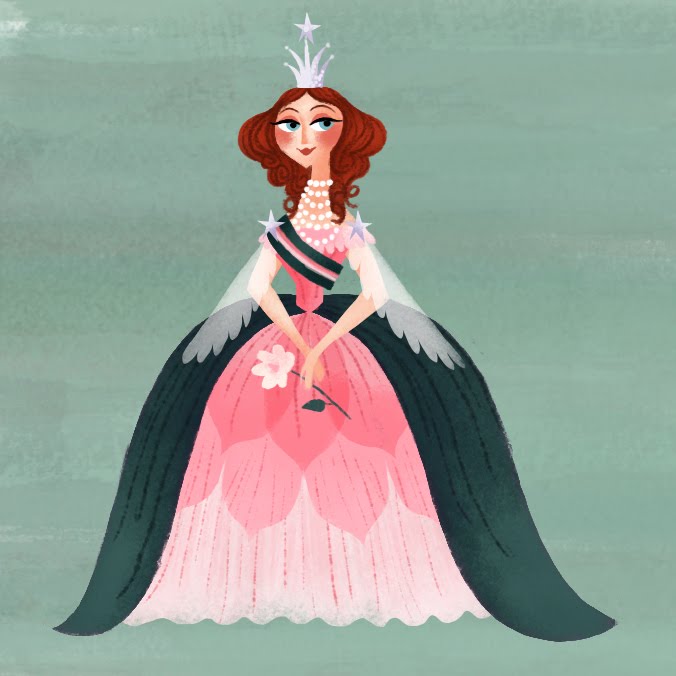


Here's all you need to do to enter the give-away:

  1. Leave a comment. Make it something amusing, for goodness sakes. And don't forget to put your e-mail in there so I can get in touch with you if you win!
  2. Wait a week. I'll be picking my winner via random number generator on February 28!


SO EASY! The matching game is not technically out yet, so you'll be getting it before ANYONE ELSE. That's really special. There's 72 pieces of matchy-match fun in that box. It also has a magnetic flap closure, which truly elevates it beyond simply a cardboard box full of cardboard bits. Really!


If it goes well, I might do a stationary give-away too. We'll seeeeeeee...

Here's some images from the matching game pieces! These are my favorites. The little black dog is my actual dog, Lila. She really sleeps on a pillow like that. She's such a princess.

The Queen


The King


Royal Dog


The Castle


Princess Lilac
Good luck!

Friday, November 06, 2009

small cats

These are going to the small stuff show at bear and bird gallery in Florida. They're small! Only 5"x5" each.

I'm trying to get bolder with my colors, and a little looser with my paintings. I tend to paint really, really, really anal-retentively, leaning over the painting and holding my breath and stuff. I think things come out a little stiff sometimes because of that though! These were small and simple enough that I could just kinda do them without over thinking.

The first one is based on my cat Milo. He was orange and crazy! Now he is a ghost cat.


The siamese is based on nothing, because I never had a siamese myself. Or maybe its based on my awesome vintage TV lamp that Sean got for me... (that is not a photo of MY lamp, but mine is seriously identical)


They're off to Florida! By by kitties!

Wednesday, June 03, 2009

les demoiselles de rochefort

Obscure films, how I love you so.


I really failed to capture how beautiful these two ladies are, and how dreamy and vibrant the film looks...but I think it turned out kinda cool anyway.

Monday, May 11, 2009

that book...

Remember that book I illustrated, and how I had to do it really fast and I didn't update my blog for like a month because of it? Well here's proof that it exists!

Right HERE!

I can't tell you how crazy it feels to search my own name on amazon and actually have something come up! By the way, I'm not responsible for the cover...that's just a screen shot from the film (weird). It's not actually available until August, but I was excited about it regardless.

AND my gallery opening was last night and it was great, if I do say so myself. So many people showed up to be supportive and check out the work and that was super awesome, and my friend Jenny + pals played some great music, and my bff Matthias made vegan cupcakes which was so sweet of him. Pictures coming soon! In the meantime, here are some little paintings from the show that were very spontaneous and fun to do...


Tuesday, April 28, 2009

Color, color, who's got the color?

I'm gonna paint these guys. I pulled these awesome color schemes from some cool vintage fabrics I found. If you're gonna bite, bite from something totally awesome, right?

I am leaning towards pink (#4), but because I am interested in your opinion, and also because I've got nobody around to bounce it off of, I'm having one of my ol' fashioned votes.

#1: Turquoise and yellow...pretty but kinda plain. My first impulse. This is the color scheme I first imagined it in.


#2: Green and orange-red together, like something you'd find in a thrift store.


#3: More muted pink and blue and warm grey...gives it a whole different feeling, doesn't it?


#4: Think pink! My favorite so far...but I like the others too...maybe it's too pink? A little too saccharine?


I'm painting it tomorrow, so don't think about it too long!